Vercasson period
1900 – 1918
A new advertising concept
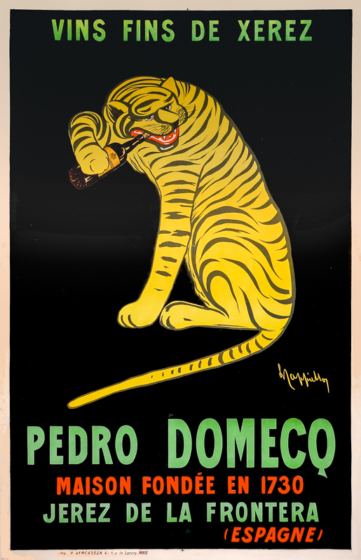
With the development of lithography, the large poster was born around 1850. At the time, people travelled on foot or horseback, and because of the slowness of their movements, they had time to look at what was displayed on walls and fences. This explains why late 19th-century poster artists such as Chéret, Mucha, Toulouse-Lautrec and Steinlen drew large, detailed prints. With the arrival of the automobile, speeds accelerated. The poster had to appeal to the man in the street as quickly as possible. It was against this backdrop that Cappiello’s posters from 1900 to 1918 ushered in a new era in advertising art, the “Vercasson period”.
In 1900, Cappiello joined forces with printer and advertising agent P. VERCASSON & Cie. He quickly laid the foundations for what would become known as the “modern poster”. He says: “When I design a poster, my first concern is to find the task. That thing which is difficult to define, which at a great distance will catch the eye of the passer-by by the intensity of its color, tickle him by the titillation of its tones and hold him long enough by the pleasantness of its appearance to compel him to read the poster.”(Annales Politiques et Littéraires, June 1, 1907). He invented the theory of the arabesque: “the essential structure of the composition, its backbone as it were, the decorative element that links together the different elements to give it ‘form'”. He also says: “The subject matter matters little. The poster doesn’t absolutely have to be in harmony with the advertised product.”(L’Art Vivant 15/12/1926 – Les Maitres de l’affiche / Cappiello by Louis Chéronnet).
Klaus Chocolate
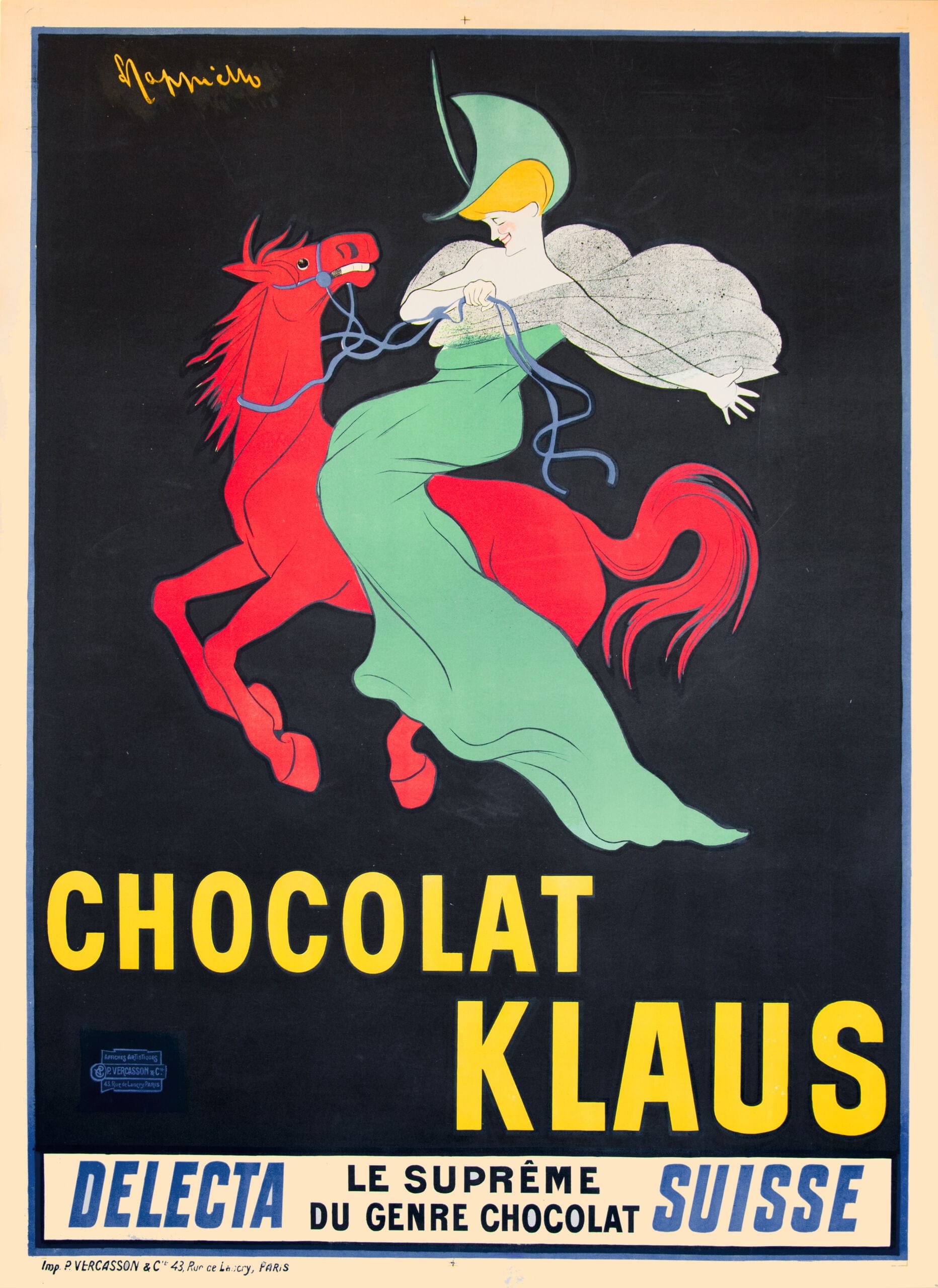
The first poster based on this theory was for Klaus Chocolate. Its impact on the public was considerable. Nothing in the design suggested chocolate, which stimulated public curiosity. Within a few weeks, the whole of Paris knew about Chocolat Klaus, and many had bought some. A little later, following further poster campaigns, the whole of Europe discovered the brand. Everyone was clamoring for “chocolate with the woman on the red horse”.
Vercasson signed an exclusive contract with Cappiello, which lasted until the Great War. Vercasson found industrial customers and acted as intermediary, while Cappiello undertook to produce each month at least 5 sketches and 4 1m x 1.4m models to enlarge existing works. In return, Cappiello was paid a minimum monthly fee . Their collaboration was a resounding success. Cappiello’s posters were sold throughout Europe, Argentina and the USA. Although
they parted company in 1918, Vercasson
continued to print a few posters for which
the sketch or model had previously been sold.
1903
The Belle Epoque
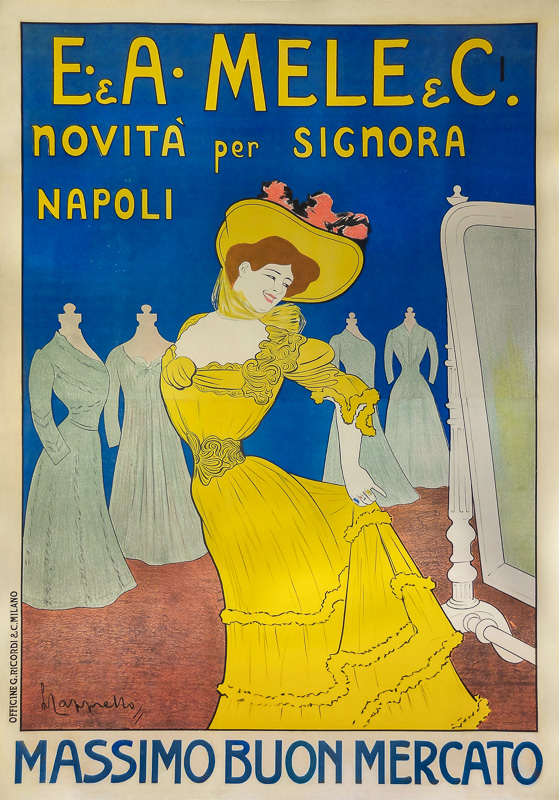
Cappiello’s posters from 1900 to 1919 belong to the so-called Vercasson period, which corresponds to the Belle Epoque augmented by the four years of war. They are large drawings with simple lines and plain backgrounds, influenced by Japanese prints. Cappiello often associates a woman with the product to be marketed. She’s a pretty Parisian woman, blond or redheaded, elegant, distinguished, a little mischievous and enticing, put in the foreground rather than the product, which remains secondary. We’re in the same spirit as Chéret’s posters, but with a much more pared-down design. Absinthe Ducros “, ” Livorno Stagione Balneare “, ” La Rose Jacqueminot “… The eye is drawn to the woman and very little to the product.
The Belle Epoque was the era of fashionable dress. Women had to wear a corset to keep their waists as slim as possible and to arch their bust forward and their pelvis back. Her essential outfit consisted of a long dress with a large, flouncy bow, a wide neckline, discreet jewelry or a necklace and an elaborate hat. She’s never static, always airy or in motion, which makes the poster very lively.
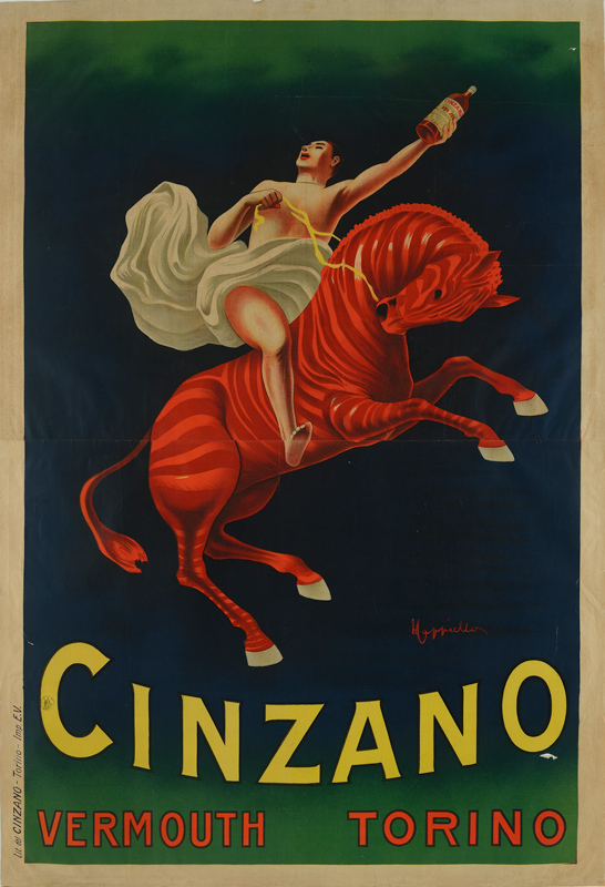
But Cappiello didn’t just use marvelous women in his posters, he also used fantastic characters, exotic or imaginary animals, gods or devils, all with a touch of humor.
